Graphic Design
Chick-In Waffle
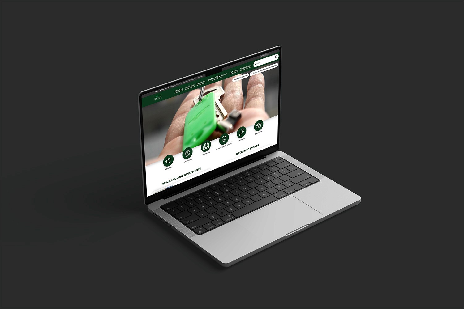
The Newmarket Housing Authority provides affordable housing programs and resources for low to moderate-income families in the Newmarket, New Hampshire community. Their services support tenants, applicants, landlords, and voucher holders by offering access to housing assistance, community information, and essential resident resources.
My Role
Graphic Designer
Duration
5 months
Tools
Adobe Photoshop, Adobe Illustrator
Overview
/Challenge
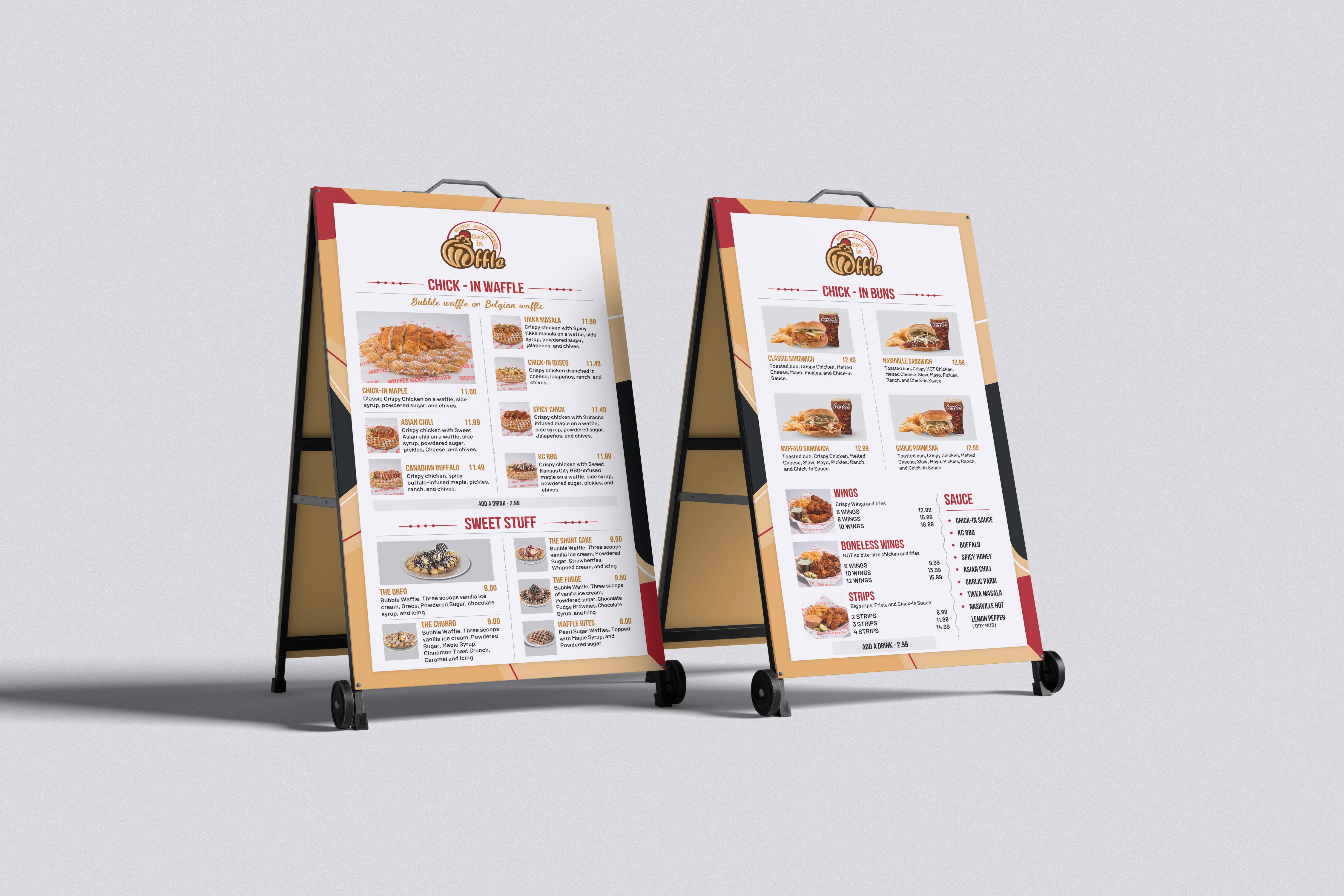
One of the biggest challenges with updating Chick-In Waffle’s menus was keeping everything fresh and visually appealing while also making sure the information was easy for customers to read quickly. Menu items, prices, and promotions changed pretty often, so I had to work fast without missing details or making the layouts feel cluttered. I also had to make sure the branding stayed consistent across different menu sizes and formats, especially since the menus were such a big part of the customer experience inside the restaurant.
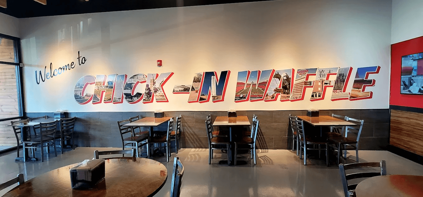
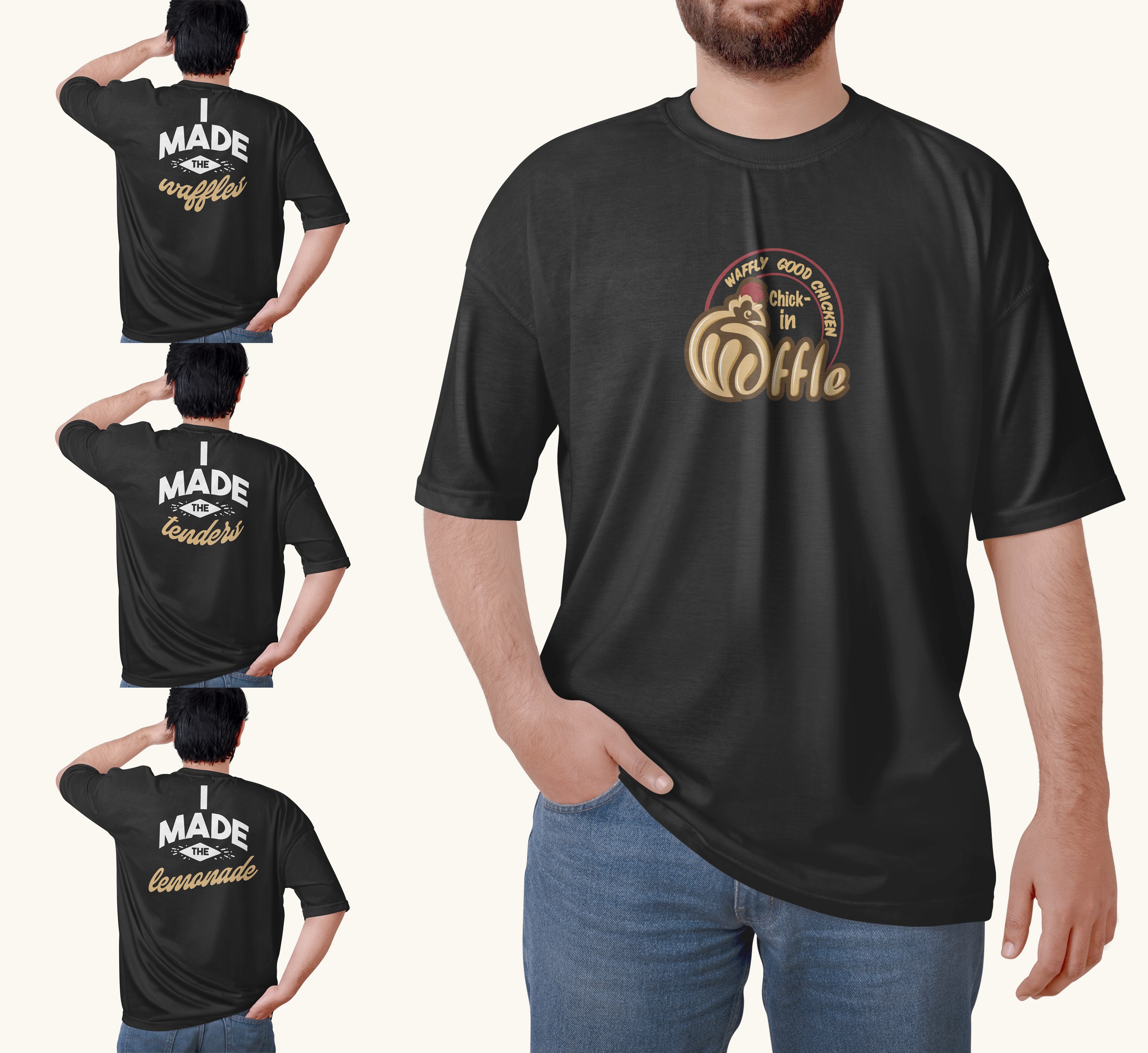
Designing the wall graphics and employee t-shirts came with their own challenges too. For the wall graphics, the owner wanted the interior decorations to feel representative of Kansas City, so I had to find ways to incorporate local culture and recognizable elements into the designs while still matching the restaurant’s overall branding. I wanted the space to feel fun, welcoming, and energetic without making it look too busy or overwhelming. The t-shirts also had to look good while being practical for employees to wear during long shifts, so I had to think about print limitations, color choices, and making sure the designs felt comfortable, professional, and still matched the personality of the restaurant.
/Solution
To solve these challenges, I focused on creating designs that felt personal to the restaurant while still being functional and visually cohesive. For the interior wall graphics, I created a large postcard-inspired design that featured photos and illustrations of recognizable Kansas City landmarks. The goal was to make the restaurant feel more connected to the local community and give the space a fun, welcoming personality that customers would remember. I balanced the imagery with clean layouts and bold typography so the walls felt visually interesting without becoming overwhelming or distracting inside the dining area.
For the employee uniforms, I leaned into the restaurant’s playful personality by incorporating fun food-related puns and lighthearted phrases into the t-shirt designs. This helped make the uniforms feel less generic and gave employees something more fun and approachable to wear during their shifts. I also simplified the artwork and focused on strong typography and easy-to-print graphics so the designs would reproduce well on fabric while still feeling polished and on-brand. Combined with the updated menus, the final designs helped create a more cohesive and recognizable identity across the entire restaurant experience.
Design